We're making bold statements
From our job-ready graduates to our recognizable brand fonts, you know when something is from SAIT. The intentional design, spacing and weight of our letterforms inform our audiences who we are.
When representing SAIT, reference the following font guidelines.

Fonts and weights
We communicate SAIT’s brand to the world, and what we say matters. To do so, we use fonts that are as confident as we are.
SAIT has two primary fonts: Titillium Web in black and bold weights and the DM Sans font family. Each type and weight have a specific function for the SAIT brand. Our fonts are legible and ready to make an impact.
Consistent use of Titillium makes SAIT instantly recognizable. The introduction of DM Sans allows for maximum readability.
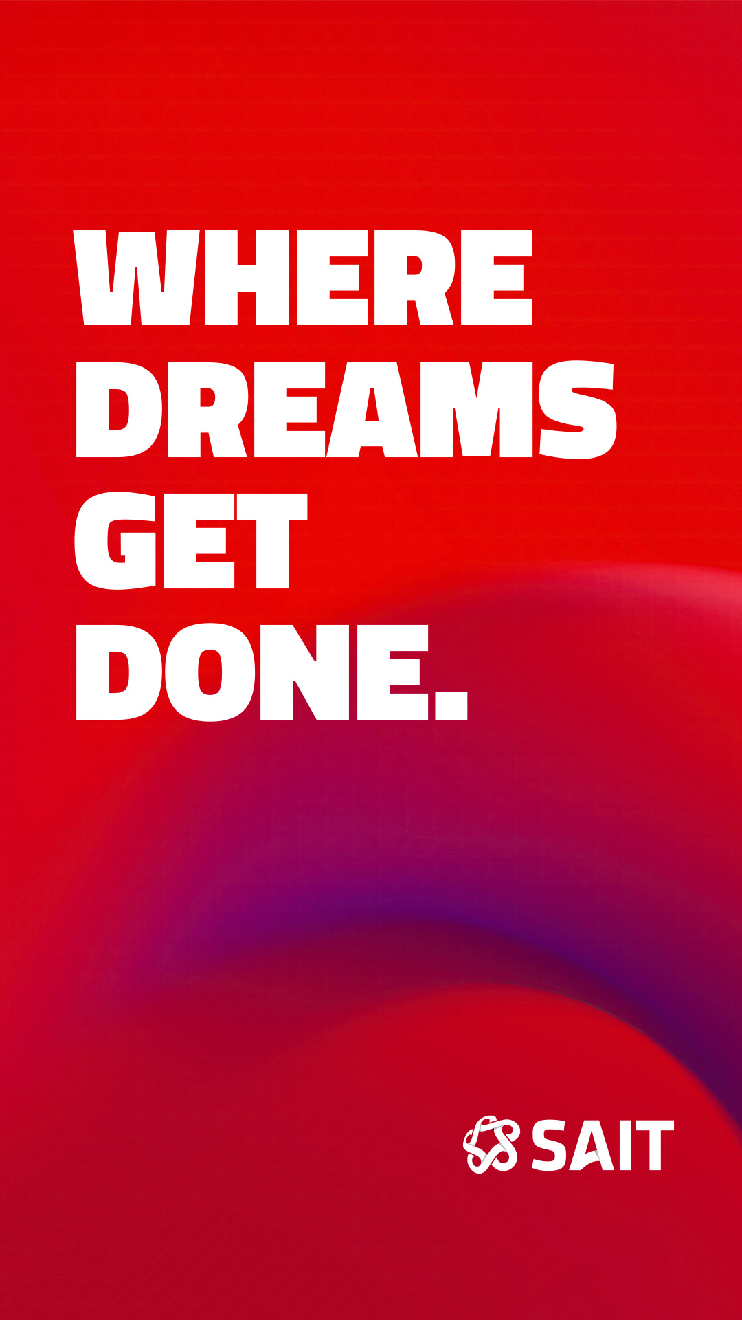
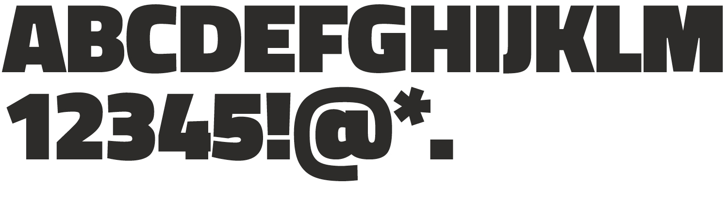
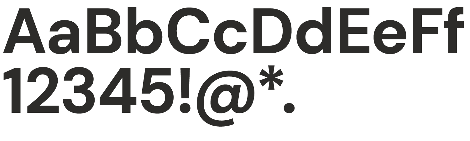
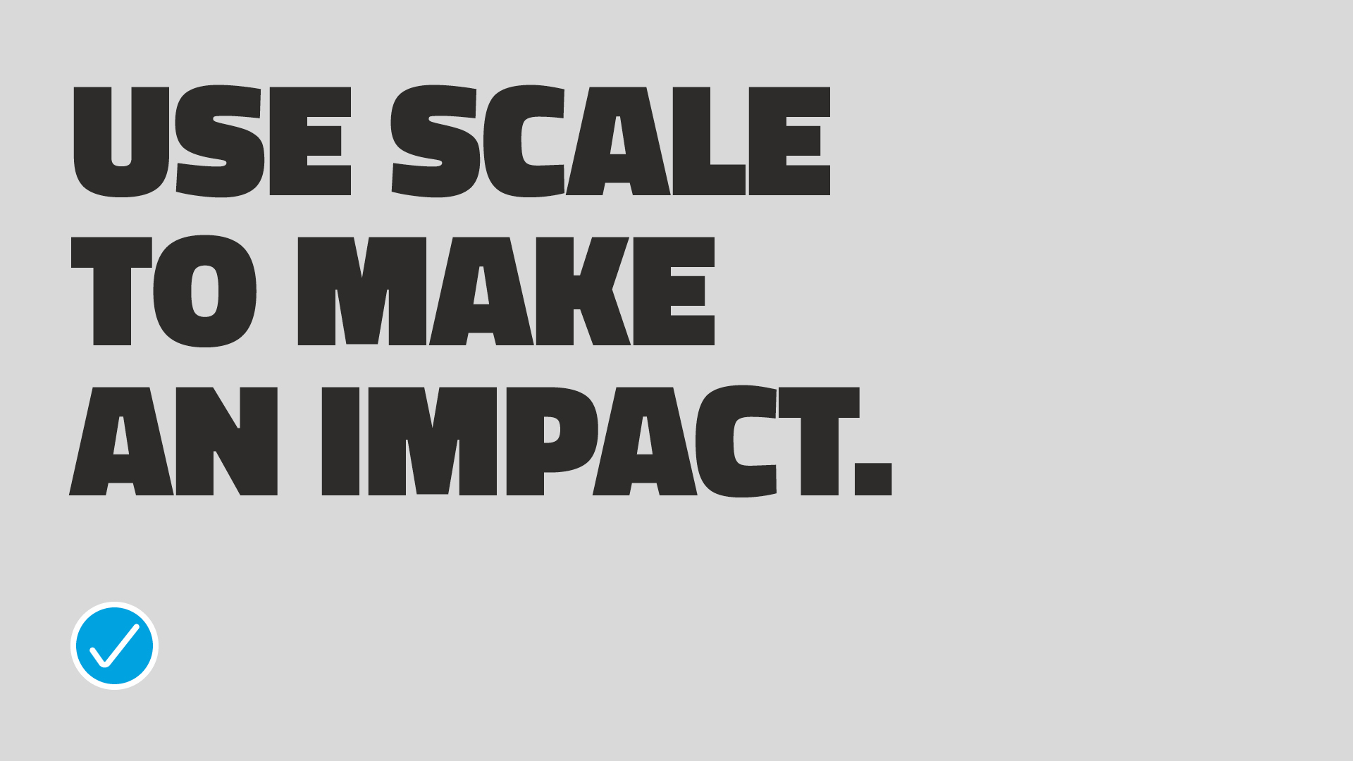
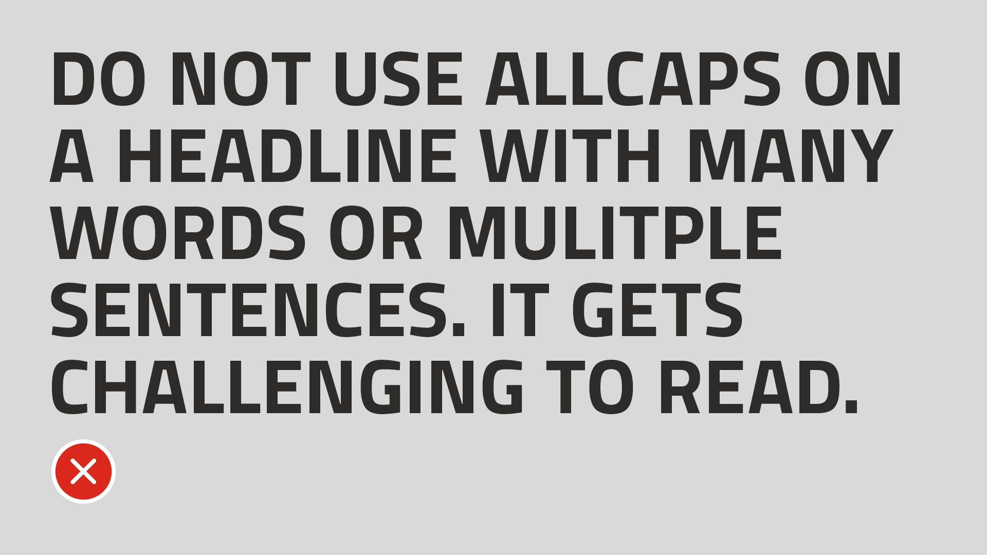
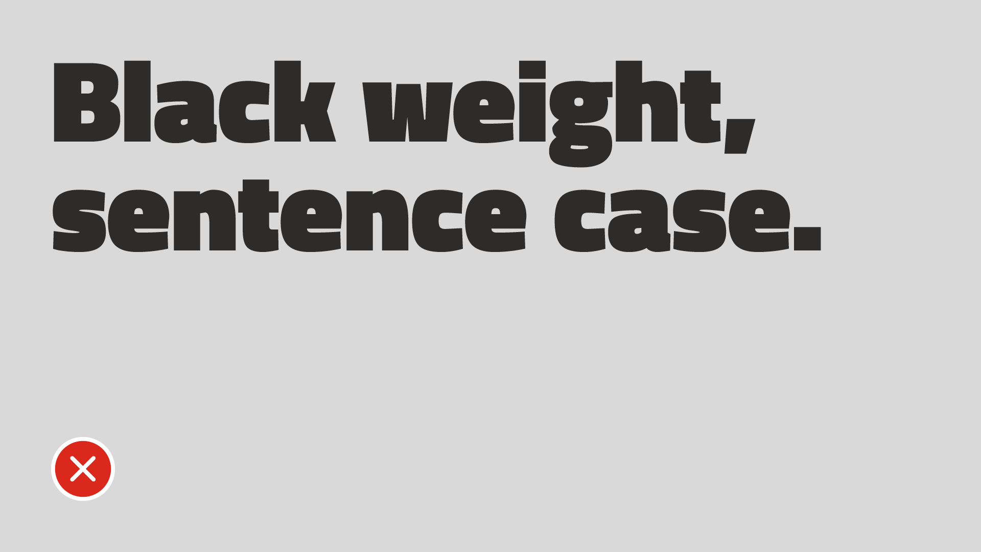
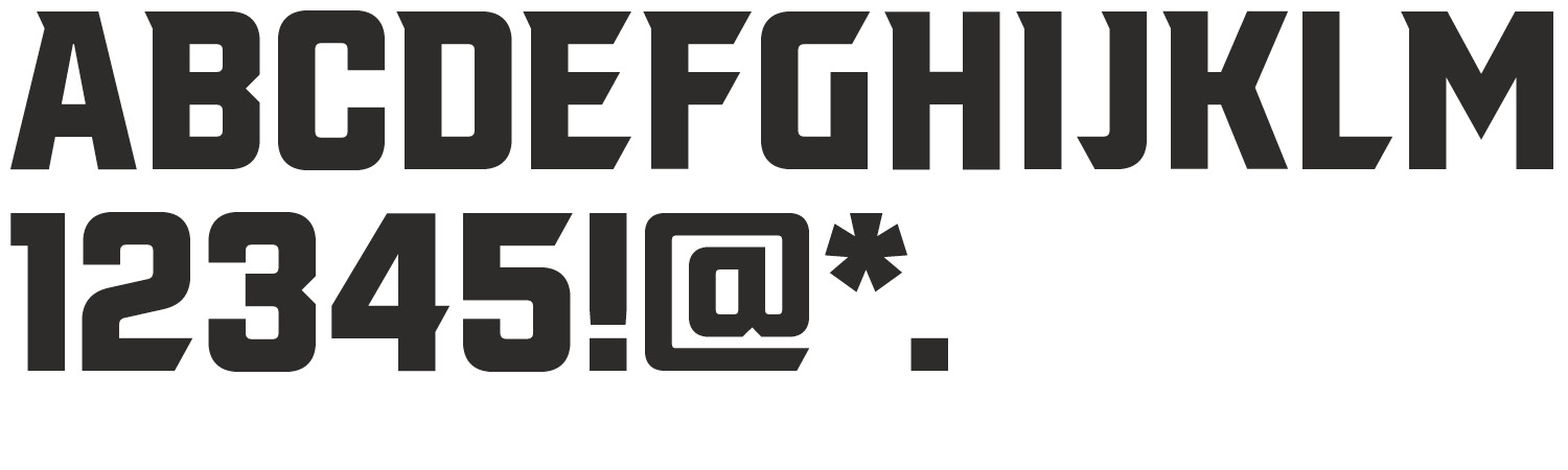
Download Titillium WebTitillium Web Black
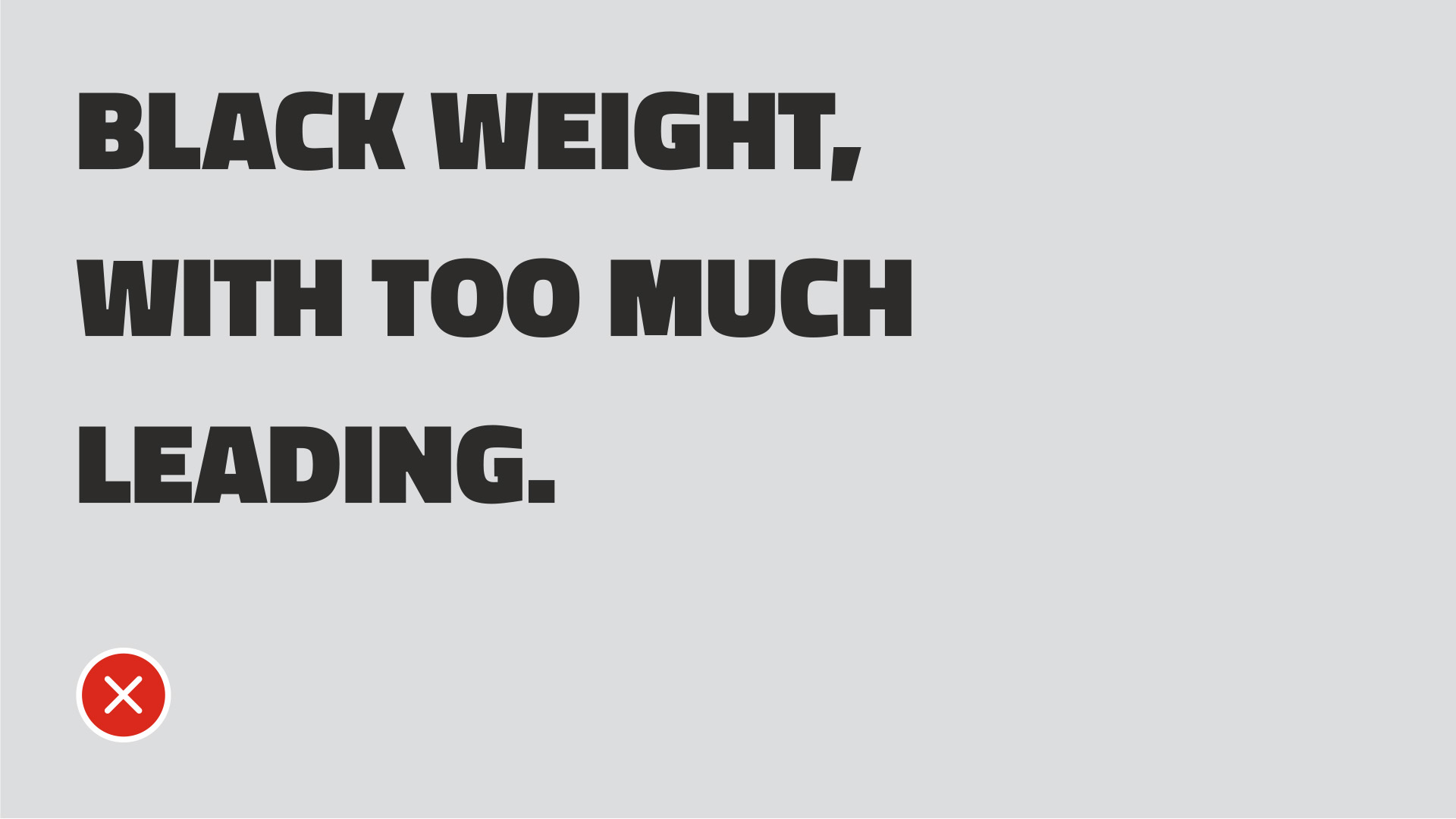
The scale of this font is as big and bold as our personality. Use this font for short headlines in all-caps only.
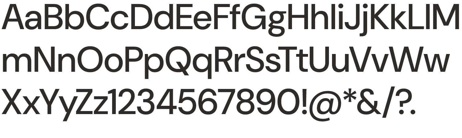
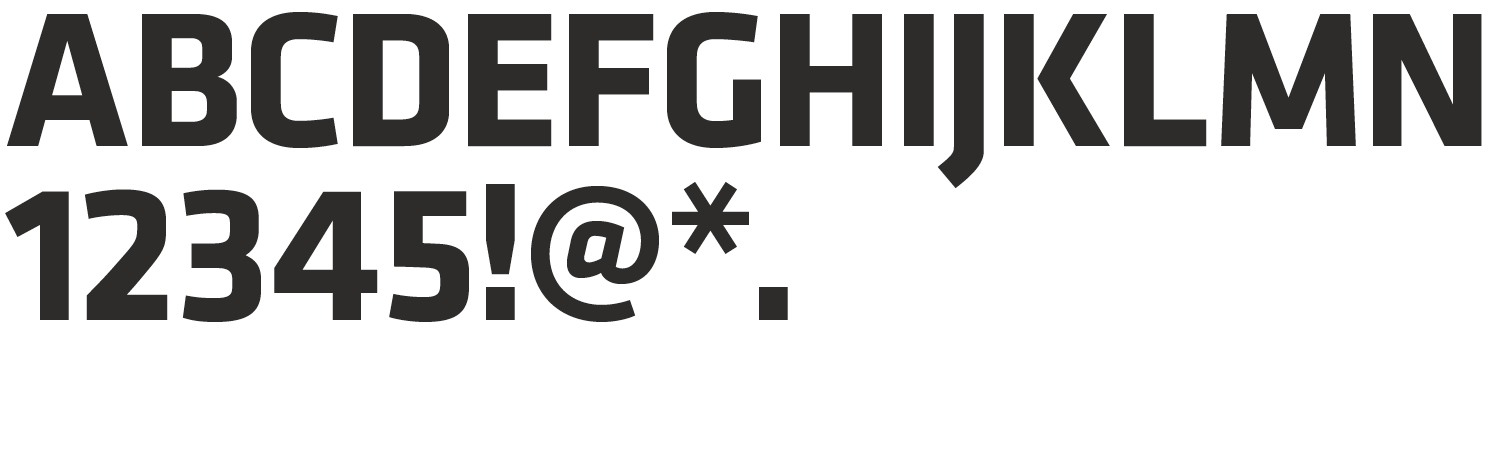
Titillium Web Bold
Use for headlines or subheads. This font is also good for longer headlines to increase legibility. It is used as the headline font on our website.
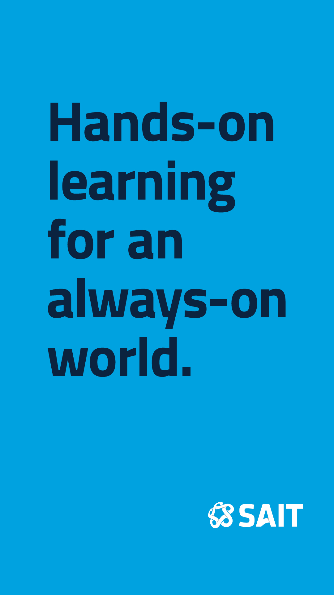
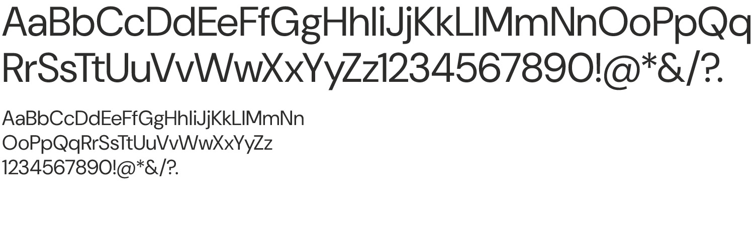
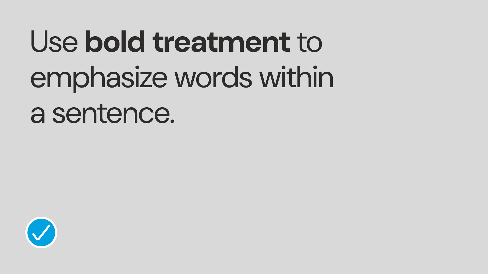
DM Sans Bold
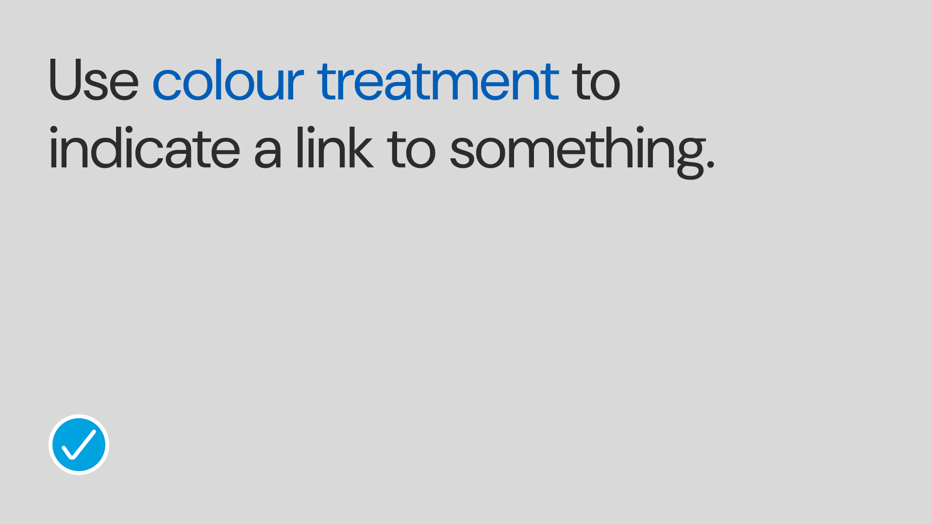
Use this font for subheads, to emphasize limited words in a paragraph, calls to action or URLs.
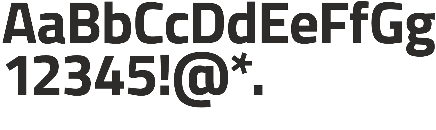
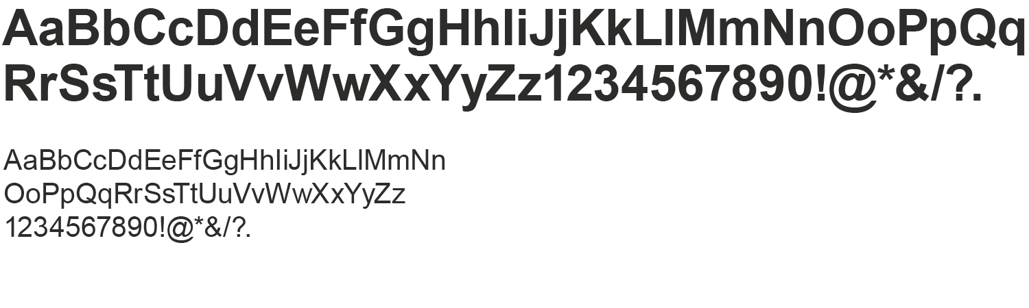
DM Sans Medium
Use to build hierarchy in subheads.
DM Sans Regular
Use for body copy or captions.
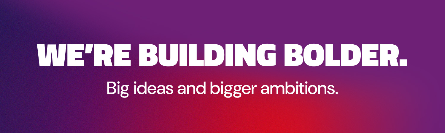
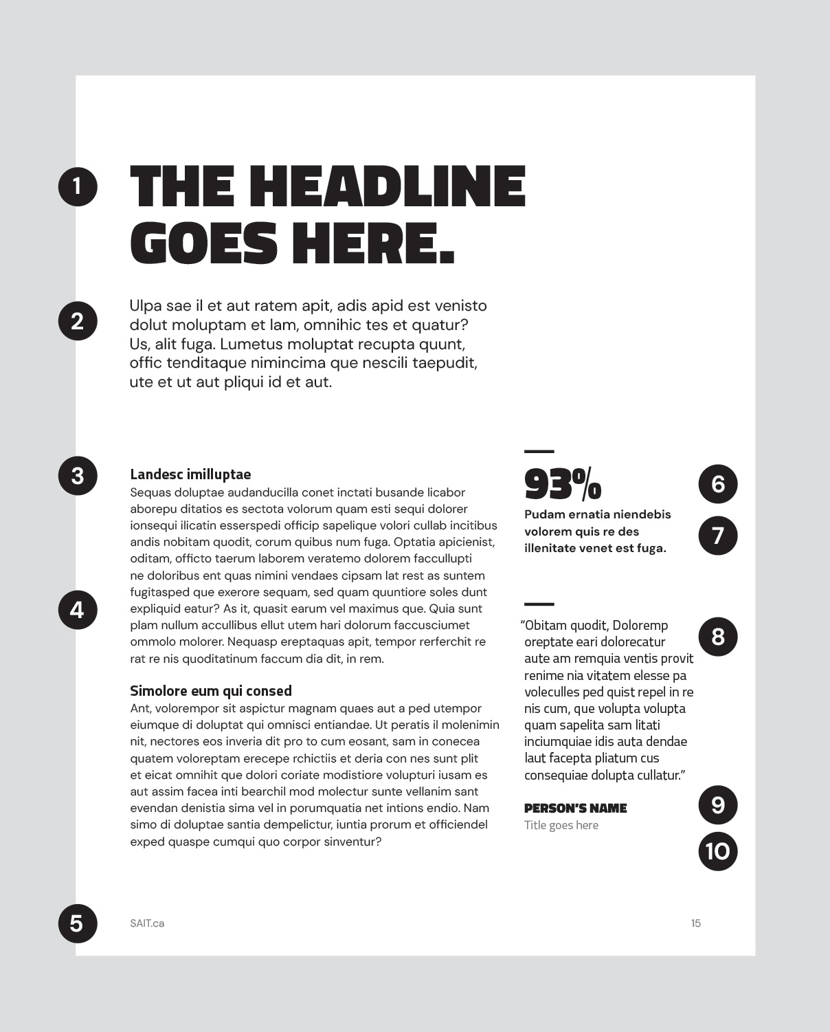
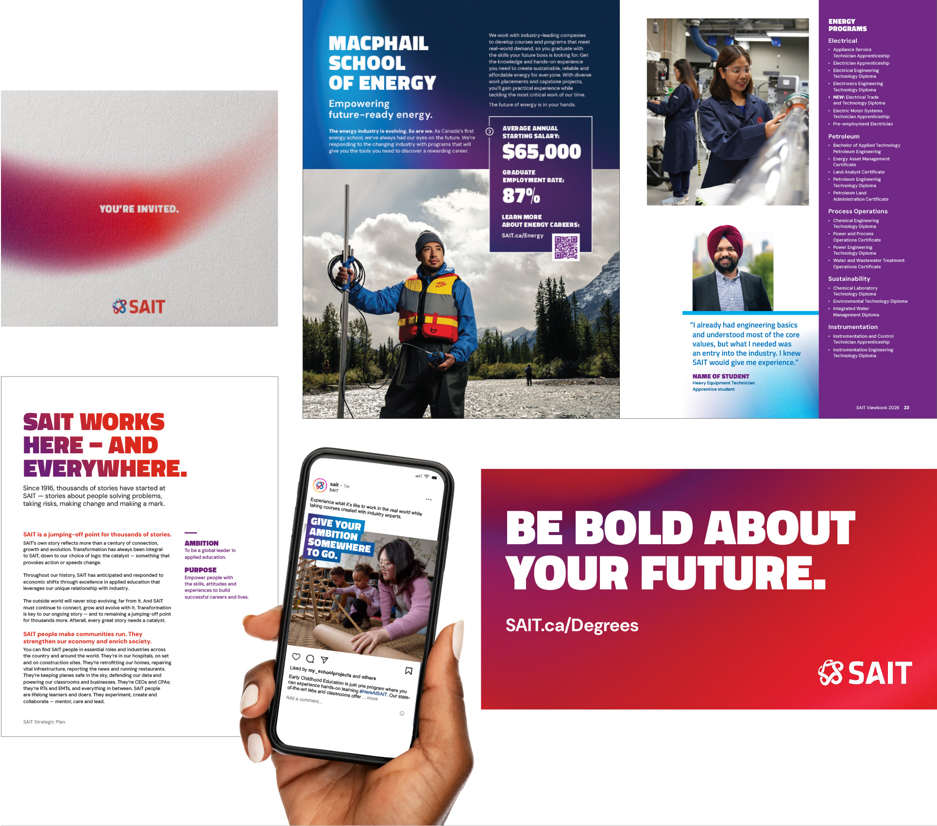
Hierarchy
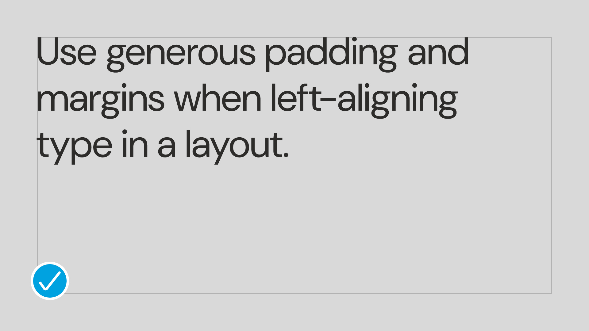
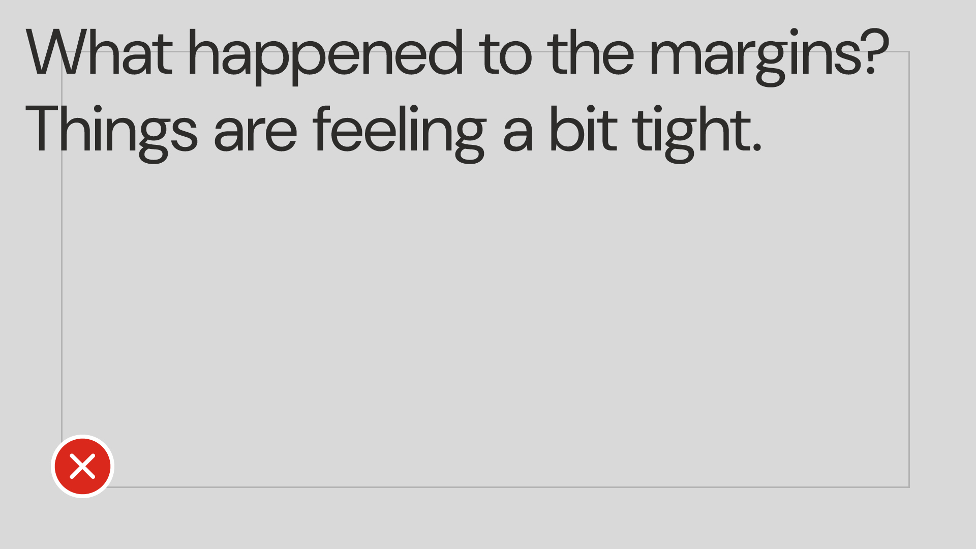
Use this example as a general guide for setting type. Always ensure intentional size or weight differences between varying levels of hierarchy.
- Heading: Titillium Web, black weight, all-caps.
- Deck: DM Sans, regular weight.
- Subheading: Titillium Web, bold weight.
- Body copy: DM Sans, regular weight.
- Footer: DM Sans, regular weight.
- Feature number: Titillium Web, black weight.
- Feature supporting copy: DM Sans, bold weight.
- Quote: Titillium Web, regular weight.
- Name of person quoted: Titillium Web, black weight.
- Title of person quoted: Titillium Web, regular weight.
Klavika
The SAIT wordmark is based on the Klavika font.
VT Redzone
This licensed font is for Trojans uniforms and SAIT merchandise where a collegiate font is appropriate. This font should not be replaced with a free font and is limited in its application.
Aptos
This typeface should be available in most circumstances. The Aptos font family may be used where Titillium Web and DM Sans are not available.
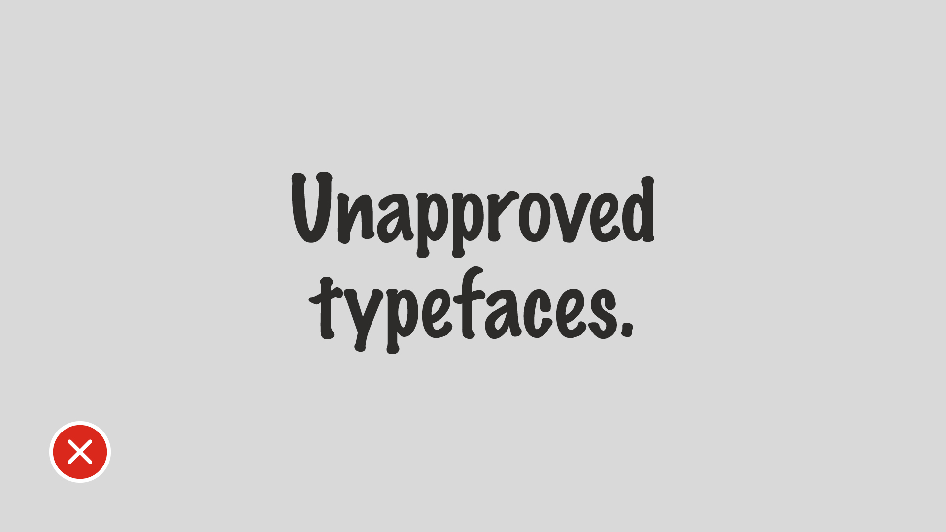
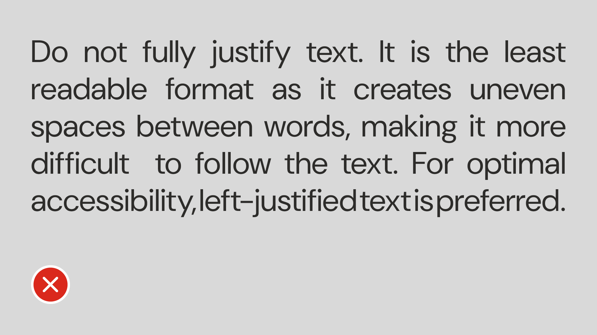
Examples
Questions?
Send us an email: brand.questions@sait.ca.

Oki, Âba wathtech, Danit'ada, Tawnshi, Hello.
SAIT is located on the traditional territories of the Niitsitapi (Blackfoot) and the people of Treaty 7 which includes the Siksika, the Piikani, the Kainai, the Tsuut’ina and the Îyârhe Nakoda of Bearspaw, Chiniki and Goodstoney.
We are situated in an area the Blackfoot tribes traditionally called Moh’kinsstis, where the Bow River meets the Elbow River. We now call it the city of Calgary, which is also home to the Métis Nation of Alberta.