Visual Identity
Overview
At SAIT, we don’t just tell our story — we live it. We started with big ideas and bold ambition. Built on industry, driven by community, and fueled by fearless curiosity, SAIT has always been about what’s next. Our visual identity is how we bring that story to life — not just in what we say, but in how everything looks and feels.
It’s more than a logo or a colour palette. It’s a system of visual elements — typography, imagery, graphics, icons, and layout — that work together to create a clear, consistent and confident impression of who we are.
Every piece of communication from SAIT should carry that spark and follow our visual identity guidelines. Explore the following sections to learn how to use our visual identity with purpose and impact.
Logos
Our logo is a visual symbol of who we are. Learn more about how and when to use the different variations of our logos.
![]()
![]()
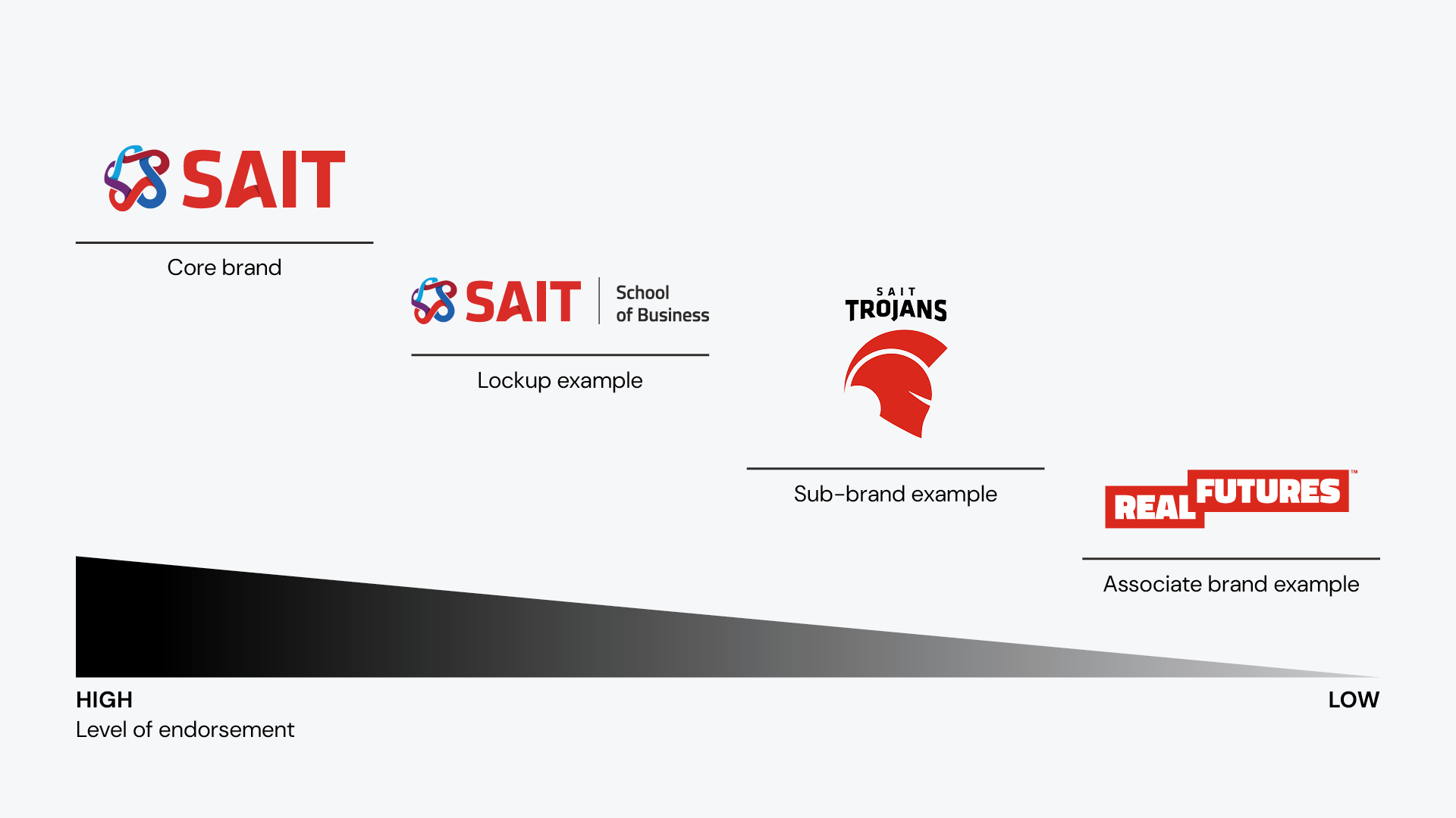
Brand architecture
SAIT is made up of different units that tend to distinct parts of our audience. These guidelines will help you understand where your unit fits within SAIT’s brand architecture when it comes to logos.
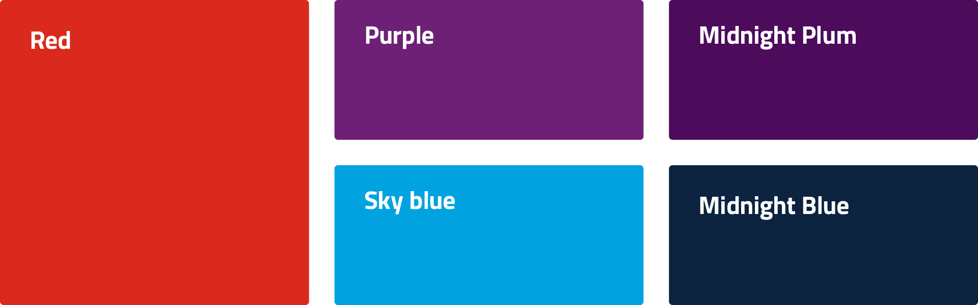
Colours
Our brand colours are uniquely SAIT. Discover how to use our palette correctly to better optimize visual appeal and accessibility.
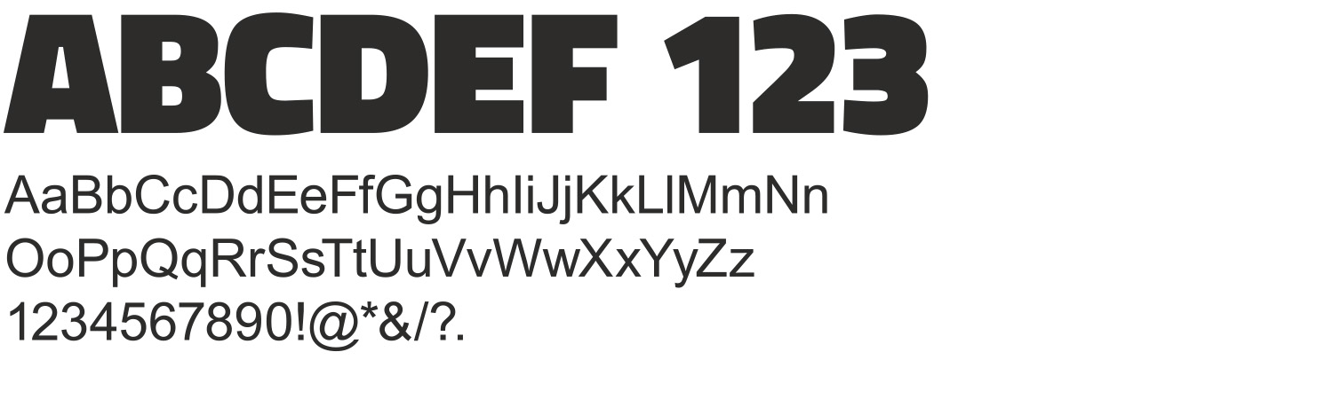
Typography
SAIT’s brand fonts include Titilium Web and DM Sans. These fonts are available to install on SAIT computers.
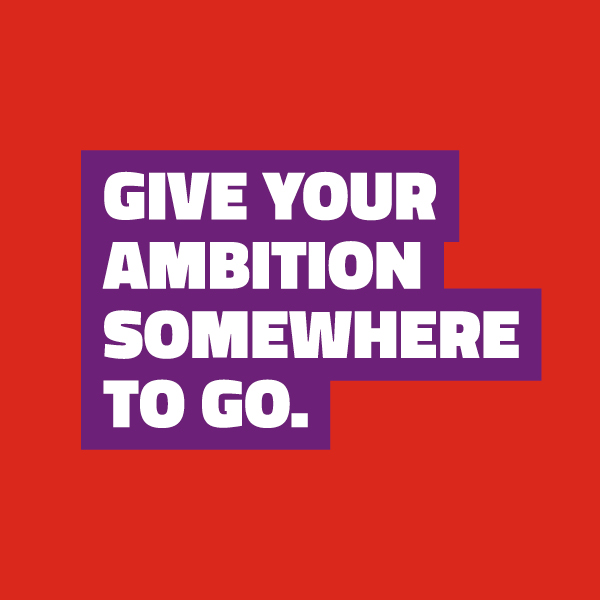
Graphic elements
Graphic elements are the visual tools that help bring our brand to life. They add energy, structure, and clarity to our communications. When used with intention, these elements create a strong, recognizable look that’s unmistakably SAIT.

![]()
![]()
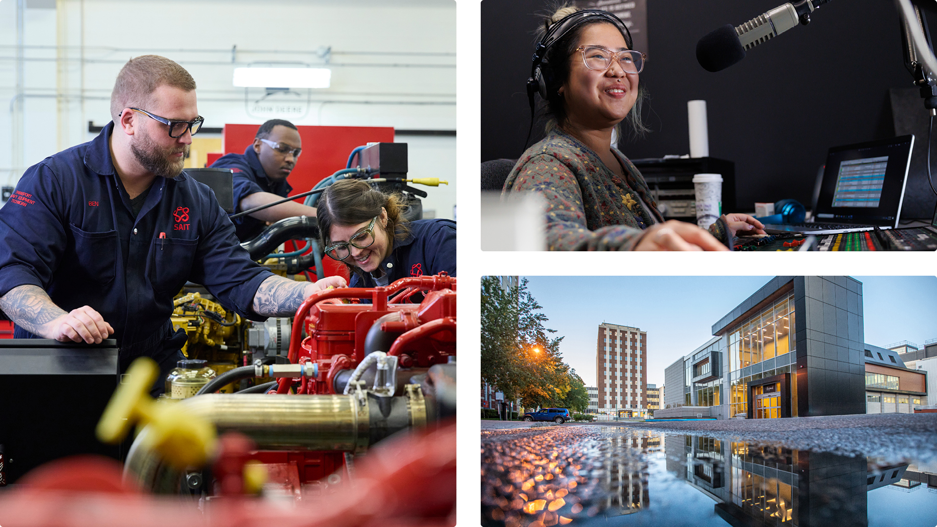
Photography
Say cheese! These guidelines help you select images from our media library. Instead of using stock photography, we’re selecting photos that reflect SAIT’s personality and authenticity.
Templates
Check back as we will populate this section with new templates on a regular basis. Thanks for your patience, as they are in development at this time.

Coming soon
More guidance is coming to help with making decisions around layout, motion, merchandise and swag. If there are items that you feel should be added to these guidelines, your suggestions are welcome at brand.questions@sait.ca.

Oki, Âba wathtech, Danit'ada, Tawnshi, Hello.
SAIT is located on the traditional territories of the Niitsitapi (Blackfoot) and the people of Treaty 7 which includes the Siksika, the Piikani, the Kainai, the Tsuut’ina and the Îyârhe Nakoda of Bearspaw, Chiniki and Goodstoney.
We are situated in an area the Blackfoot tribes traditionally called Moh’kinsstis, where the Bow River meets the Elbow River. We now call it the city of Calgary, which is also home to the Métis Nation of Alberta.