Design treatments
Currents, overlays, text highlights, icons and other supporting graphic treatments create a distinctive visual language that strengthens recognition of the SAIT brand and brings consistency across our communications. These elements are intended to work as part of a complete design system, not as decorative assets applied independently. When used strategically, they enhance hierarchy, improve readability and reinforce our brand. When used inconsistently or outside of established guidelines, they can dilute our visual identity and reduce the impact of our communications.
Scale of design
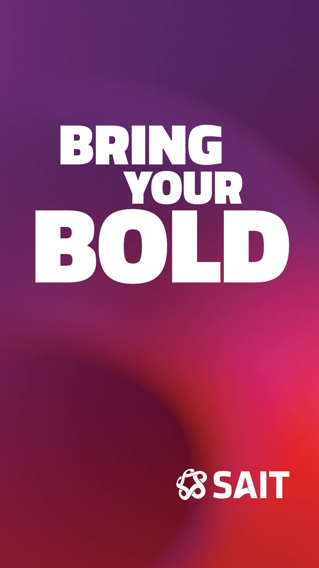
Our brand design elements offer a flexible range of expression — from simple and refined to bold and dynamic. A clean layout using our brand colours and fonts is just as on-brand as a layout featuring background currents and overlays. Simpler treatments using our core brand elements of colour, typography and photography work well for internal or functional use. The advanced graphic elements like background currents and overlays are more ideal for external-facing materials, strategic marketing initiatives, high-profile events and advertising campaigns. The key to a successful design is thoughtful application that supports clear, consistent brand messaging.
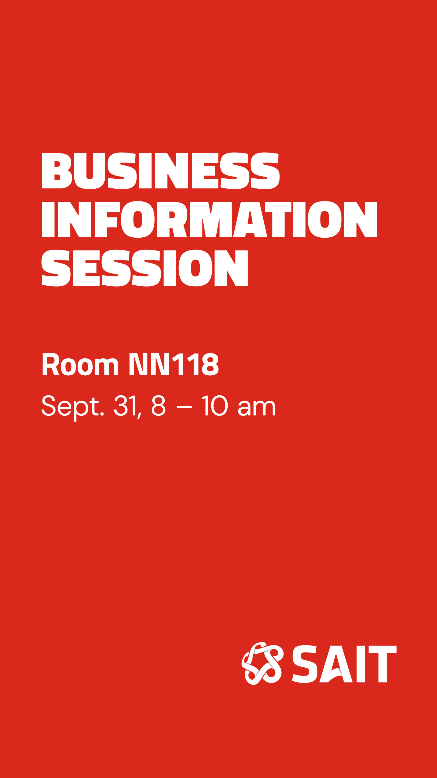



Advanced graphic elements
Graphic elements such as currents, overlays and custom graphic compositions should only be used by the SAIT Brand and Creative team, agencies or designers who have been onboarded by the Marketing department or our creative partner XDocs. Self-service templates and everyday communications should rely primarily on SAIT's core brand elements: our logos, colours, typography and photography unless otherwise directed. The guidance below is intended for those creating approved strategic marketing materials and should be followed to ensure a consistent and recognizable SAIT experience across all communications.
Background currents
Catalyst currents are one of SAIT's most distinctive graphic elements, representing the energy, momentum and optimism that define our brand. Used strategically, they add movement, depth and visual interest while reinforcing a cohesive and recognizable brand experience.
As an advanced component of SAIT's visual identity, currents should be applied thoughtfully and consistently as part of a professionally designed composition. The SAIT Brand and Creative team, agencies or designers who have been onboarded by the Marketing department or our creative partner XDocs may use these for strategic communications. They should not be used as standalone decorative elements or incorporated into self-service templates. They do exist in select templates available to employees.



An appropriate zoom and crop treatment
The currents must be cropped and scaled to suit the composition, and their integrity and appearance maintained. By zooming, cropping and rotating the these graphics, you can achieve an inspirational look – ranging from bold, prominent strokes to more subtle textures. Particular colour combinations are specified in their use. Please note these are not intended for every project nor are they simply interchangeable.







DO: Use the background current behind text.

DON’T: Change the colour or create your own version of the background currents.

DO: Zoom and crop the background to create an abstract shape.

DON’T: Use the background current at 1x scale.

DO: Use a background current for high-level institutional strategic messaging.

DON’T: Use the background current for informational or transactional messaging.
Overlays
A collection of overlays with a transparent background can be used to bring vibrancy, energy, boldness and ownership to a layout. When used over photography, they can help simplify complex visuals and can create quiet space for text or logo readability. Overlays are anchored to any edge of the page and placed over images or a white or colour background. They can be enlarged and rotated as needed, always keeping their proportions.

DO: Use an overlay as a layering element to add visual interest.

DON'T: Use an overlay on an image without something on top, like text or a logo.

DO: Use an overlay to enhance the legibility of your text or logo.

DON'T: Place an overlay on top of a person's face or a key area of interest.

DO: Use an overlay anchored from an edge.

DON’T: Use an overlay in the middle of your material.

DO: Layer an overlay under a text frame, even use a background current of a similar colour combination in the text frame.

DON'T: Use more than two overlays and choose only one colour of overlay per page/piece.
Text frame highlights
he text frame highlight graphic treatment can be used to create visual interest, improve readability of headlines, and add a bit of SAIT flair to your piece. It is primarily used on headlines with Titillium Web, black weight, all-caps font. As with typography, it’s important to carefully consider colour combinations to ensure harmony between colour, graphic elements and text for clarity and impact. In addition, there are guidelines to follow to ensure consistency of use across all materials. They can be used with background currents and overlays or on their own.

DO: Overlap the highlights with consistency in space as visualized above.

DO: Highlight the entire headline.

DON’T: Highlight only one word in a headline.

DO: Use a text highlight to make headlines legible over a busy image.

DON’T: Have a space between highlights that go over multiple lines.
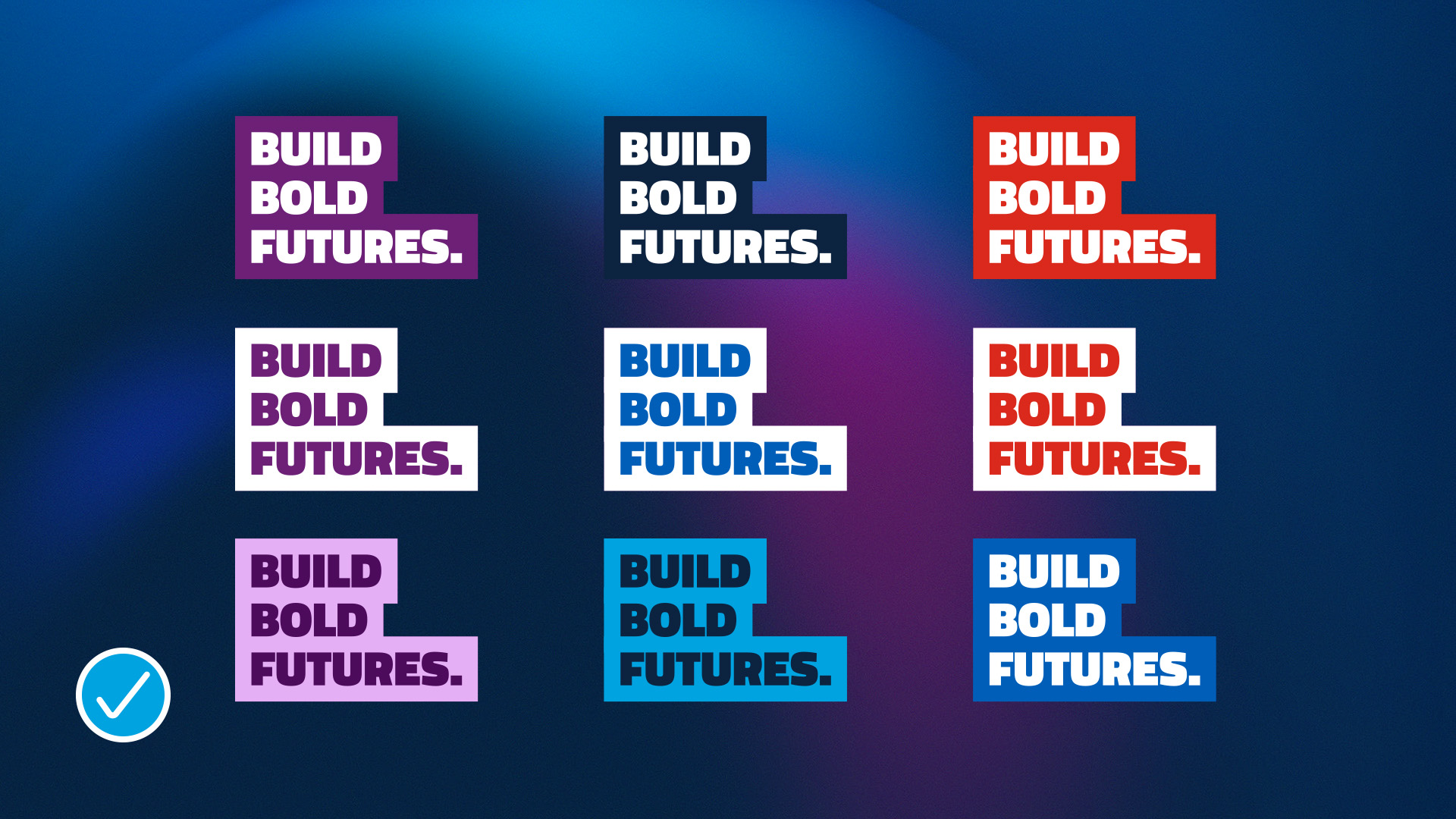
DO: Select text and highlight colours that are legible and complementary to the background.

DON’T: Select text or highlight colours that do not meet accessibility guidelines.
Basic graphic elements
Basic graphic elements can help clarify information, improve readability and add personality when used intentionally. These supporting elements should complement, not compete with, SAIT's core brand elements and be used sparingly to reinforce key messages. Consistent application helps create clear, engaging communications while maintaining a cohesive brand experience.Utility icons
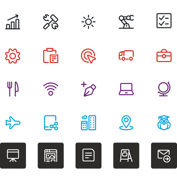
Utility icons are all about function. Clean, practical, and purpose-driven, they’re designed to communicate quickly and clearly — even at the smallest sizes. Keeping them simple and minimal helps maintain clarity and ensures they remain easily recognizable no matter the scale.
Stripping away unnecessary details improves legibility, supports consistency, and enhances usability. Select line icons over fill icons and make sure they are all consistent in weight and look across your material.
Our preferred icon library is Streamline. Groups and departments can sign up for an account to access this resource. Using a shared library helps maintain consistency across all materials and ensures that icons align with our design standards.
Illustrations
To maintain a strong, authentic SAIT brand, avoid using illustrations in any branded materials. They often lack the consistency and distinctiveness needed to represent our identity effectively.
SAIT’s visual identity is grounded in authenticity. Use photography that features real people and real moments to tell stories, convey ideas, and spark emotion. If photography isn’t an option, rely on clean typography and SAIT colours to create visual interest. These simple treatments used in combinations are uniquely SAIT — and they speak louder than generic stock illustrations ever could.

DO: Work with an approved creative partner and expand on utility line icons to create illustrations. This is an excellent example of being creatively unique while building trust and reinforcing our brand.

DON'T: Generic stock illustrations do not add value to our brand, instead rely on typography, colours and photography.

DON'T: Use AI to create illustrations. Not only are the generated images not authentic, they create inaccuracies and lack brand distinctiveness.
Emojis
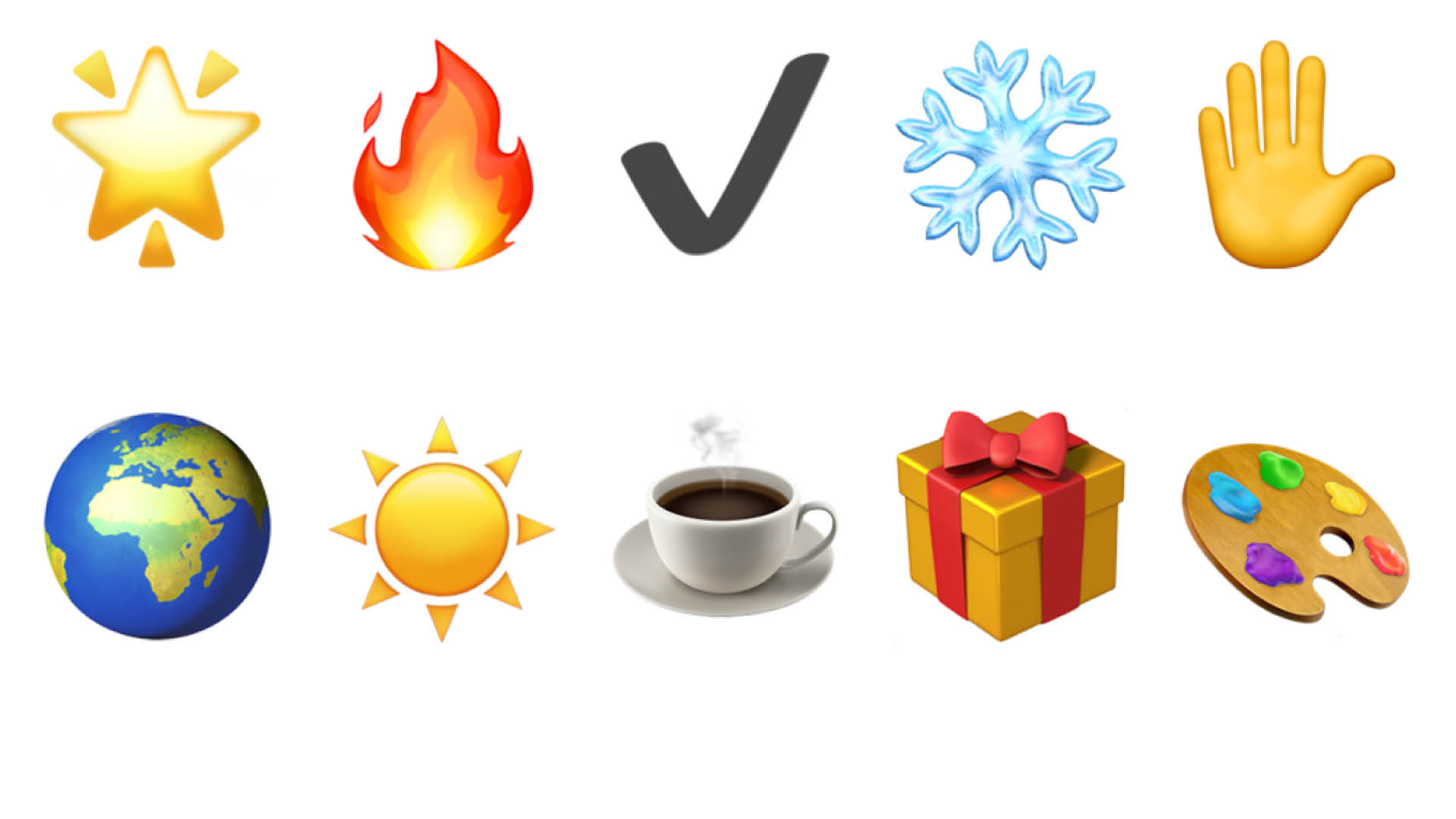
Emojis can be used in written content to add personality and engage audiences, but they should be used sparingly and only in specific instances. Their primary use should be on social media platforms and they should never appear in print materials, official documents, or signage. Always consider the context and the brand's overall voice when deciding whether an emoji is appropriate to include.
It is important to also consider the frequency of emoji use. One to three per social post is generally appropriate, depending on the length of the copy.
GIFs and memes
Avoid using GIFs in any branded materials. SAIT’s visual identity is centred around images that capture real moments.
To maintain a strong, authentic and professional SAIT brand, also avoid using memes in any branded materials. If you are wishing to convey a friendly and more playful tone, choose on-brand photography and pair it with copy that supports your desired message.

Questions?
Send us an email brand.questions@sait.ca.

Oki, Âba wathtech, Danit'ada, Tawnshi, Hello.
SAIT is located on the traditional territories of the Niitsitapi (Blackfoot) and the people of Treaty 7 which includes the Siksika, the Piikani, the Kainai, the Tsuut’ina and the Îyârhe Nakoda of Bearspaw, Chiniki and Goodstoney.
We are situated in an area the Blackfoot tribes traditionally called Moh’kinsstis, where the Bow River meets the Elbow River. We now call it the city of Calgary, which is also home to the Métis Nation of Alberta.