Our colour palette
SAIT’s colour palette plays an important part in our brand identity. As our brand has evolved, we have updated our colour palette to allow for more accessibility and an enhanced, energized brand look and feel.
On this page, you can discover what colours are part of SAIT’s palette and learn how to use them adequately to optimize visual appeal and accessibility to be on brand.
Core palette
Colour is a large part of our identity and a key aspect of brand recognition. People recognize SAIT’s vibrant red and blue tones, and these colours will always be part of our heritage. With our brand evolution, we want to show our future growth by introducing new primary colours to our core palette. Midnight plum, purple, midnight blue and sky blue were added to our primary colour palette to favour accessibility.
Please refer to the colour combinations section to see application examples.

Red
Hex: #DA291C
RGB: 218 / 41 / 28
CMYK: 5 / 98 / 100 / 0
PMS: 485C

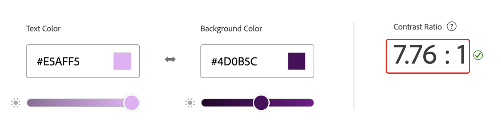
Midnight plum
Hex: #4D0B5C
RGB: 77 / 11 / 92
CMYK: 67 / 100 / 4 / 42

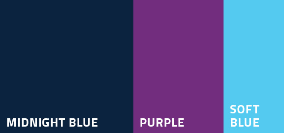
Purple
Hex: #6D2077
RGB: 109 / 32 / 119
CMYK: 67 / 100 / 4 / 5
PMS: 259C

Midnight blue
Hex: #0C2340
RGB: 12 / 35 / 64
CMYK: 100 / 66 / 0 / 76

Sky blue
Hex: #00A3E0
RGB: 0 / 163 / 224
CMYK: 86 / 8 / 0 / 0
PMS: 299C
Extended palette
Our extended palette complements our primary colours with more energized hues allowing for better accessibility. The colours deep red, soft purple, soft blue and blue can be paired with the core palette tones in text or other graphic elements without overpowering them. Soft purple and soft blue should not be used as background colours.
Please refer to the colour combinations section to see application examples.

Deep red
Hex: #A6192E
RGB: 166 / 25 / 46
CMYK: 7 / 100 / 82 / 26
PMS: 187C

Soft purple
Hex: #E5AFF5
RGB: 229 / 175 / 245
CMYK: 12 / 27 / 0 / 0

Soft blue
Hex: #55CAF0
RGB: 85 / 202 / 240
CMYK: 56 / 0 / 2 / 0

Blue
Hex: #005EB8
RGB: 0 / 94 / 184
CMYK: 93 / 67 / 0 / 1
PMS: 300C
Neutral palette
We are introducing two neutral hues to provide further accessibility options and flexibility. Charcoal is intended for body copy when the background is white (or light grey), but it shouldn’t be used as a background colour. Light grey, on the other hand, can be used as a background colour or for body copy when the contrast is appropriate.
Please refer to the colour combinations section to see application examples.

Charcoal
Hex: #212529
RGB: 33 / 37 / 41
CMYK: 0 / 0 / 0 / 90

Light grey
Hex: #F6F7F9
RGB: 246 / 247 / 249
CMYK: 0 / 0 / 0 / 4
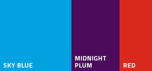
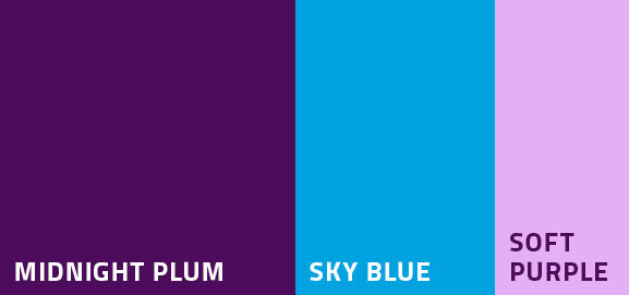
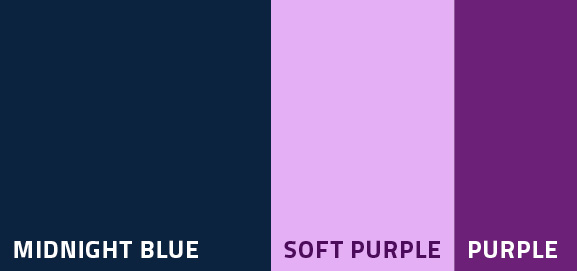
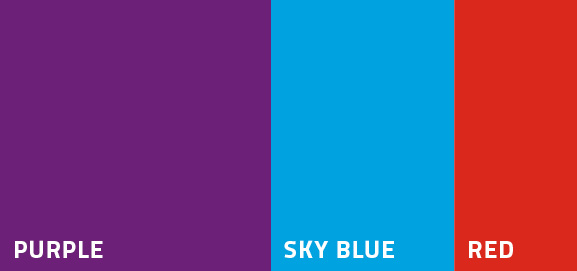
Colour combinations
While there are many possible combinations between all of the colours in our palettes, not all of them feel like SAIT. We want to ensure that the material being seen by the public makes them feel connected to us. It's important to keep contrast and accessibility top of mind when creating colour combinations. Please refer to the next section, accessibility, to learn more about contrast.
Colours from our palettes can be combined in groups of two or three tones at a time. It's best to avoid using more than three colours in the same piece. Looking for a quick tip on how to use our colour palette? When creating colour combinations, a good rule is to select a primary colour (most often used as a background colour), a secondary colour (to use for headlines, body copy or graphic elements) and an accent colour, which can be from our core, extended or neutral palettes (to use for graphic elements or call to action).
Below are some of the most effective colour combinations:
Accessibility
Accessibility should always be top of mind when creating visual assets and materials. It’s no secret that we want to create assets that are visually appealing, easily identified as SAIT and easy to read. Accessibility goes a step further by considering people with disabilities and ensuring they can perceive the contents of a visual piece, such as a poster, brochure, banner or web page.
How do we design with accessibility in mind? Consider the choice of:
- colour - do the colours chosen make the piece easy to read?
- size - is the text an appropriate size?
- hierarchy - is the most important information first? The header is the first and largest element on the page. As you move down the page, the sub-header, body copy, call to action (CTA) and other elements will be smaller. This funnel-like effect makes content easier to digest at first glance.
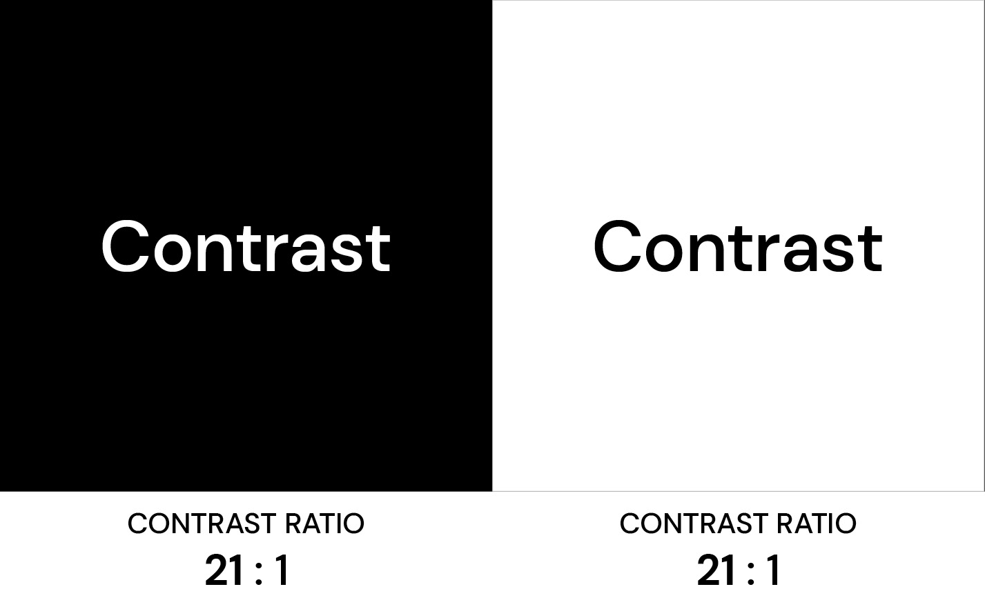
Contrast
Contrast is the difference in how light and dark colours behave together. This brightness difference, or contrast, is expressed as a ratio ranging from 1:1 (white on white) to 21:1 (black on white).
Although it might be tempting to pick two of your favourite colours from SAIT’s palettes and put them together as a background and text, it’s important to ensure that the colours you choose contrast each other. There’s an easy way to do this, and it’s by using the Web and Content Accessibility Guide (WCAG) as a reference point.
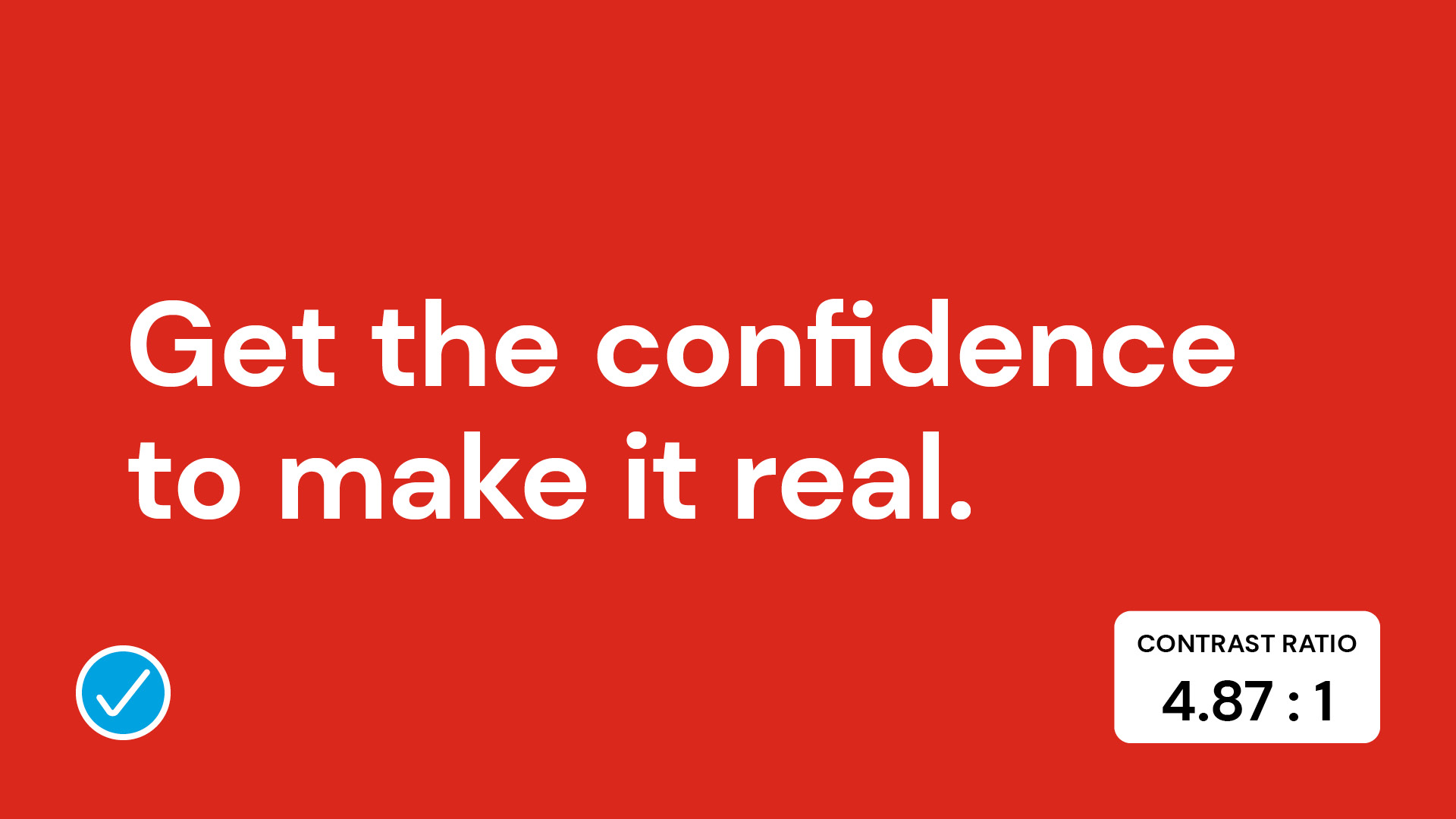
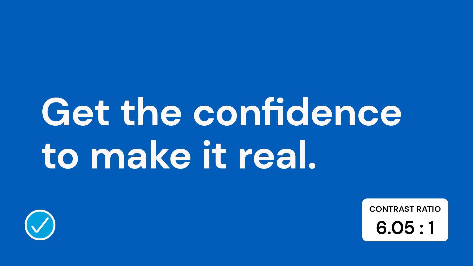
Visual assets created using SAIT's brand should meet WCAG Level AA, meaning the text and images must have a contrast ratio of at least 4.5 to 1. To find out the contrast ratio for your design and if it passes WCAG Level AA guidelines, you can use the WebAIM tool or Adobe colour accessibility tools.
Principles
This is a guide that outlines general colour principles. Use them as a reference any time our colours are used.
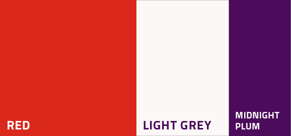
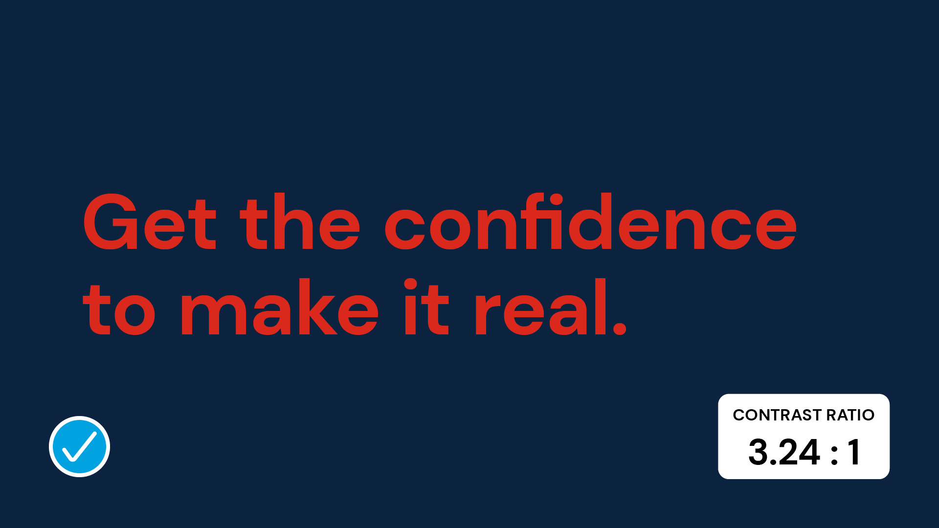
Consider using white or warm light grey as an alternative colour to create adequate contrast.
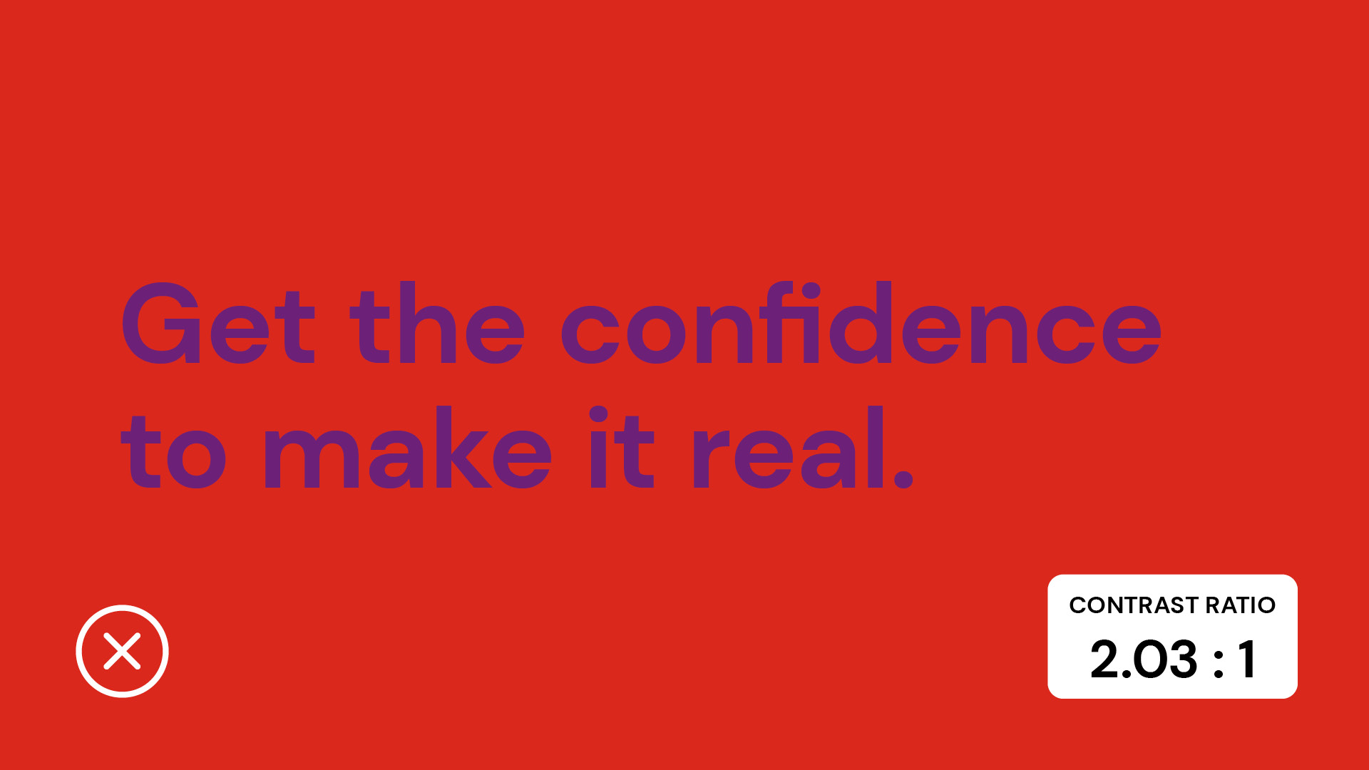
Purple text over a red background has a contrast ratio of 2.03 to 1. This colour combination does not have enough contrast to meet the minimum accessibility requirements of 4.5 to 1.
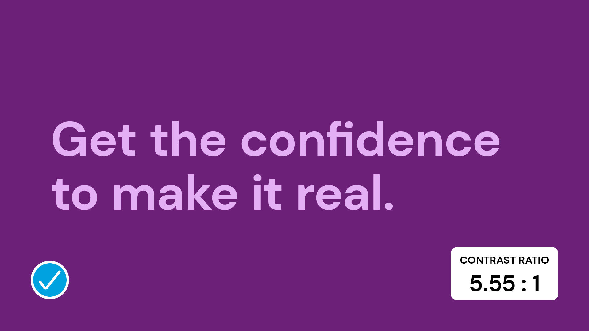
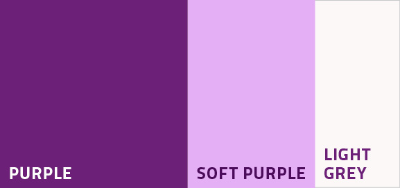
Consider using light purple as an alternative to create adequate contrast.
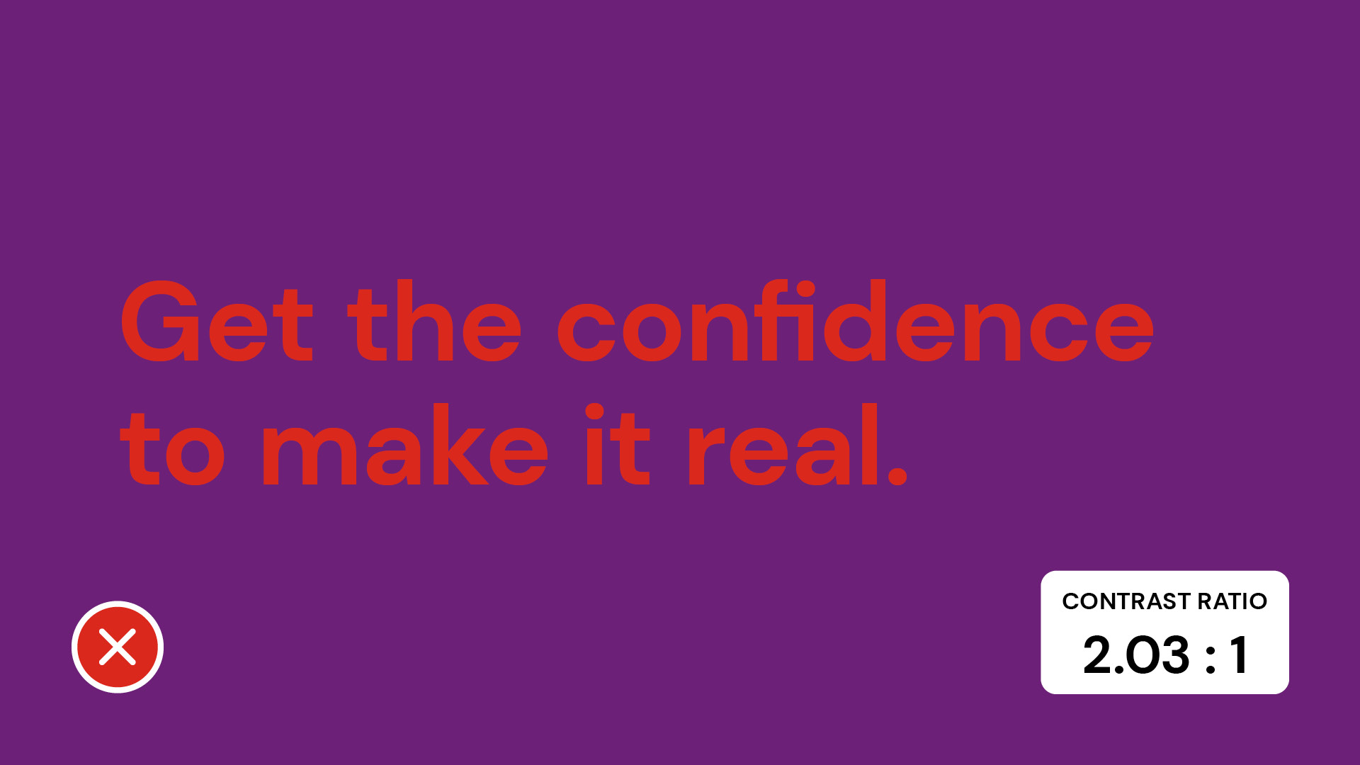
Red text over a purple background has a contrast ratio of 2.03 to 1. This colour combination does not have enough contrast to meet the minimum accessibility requirements of 4.5 to 1.
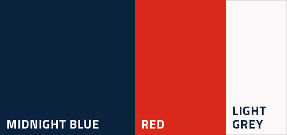
Consider using warm light grey as an alternative to create adequate contrast.
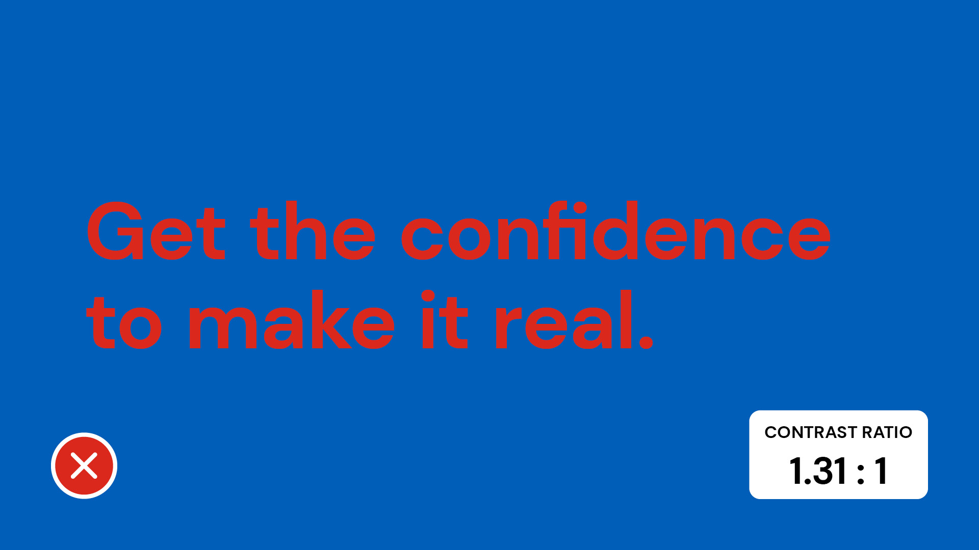
Red text over a mid-blue background has a contrast ratio of 1.31 to 1. This colour combination does not have enough contrast to meet the minimum accessibility requirement of 4.5 to 1.
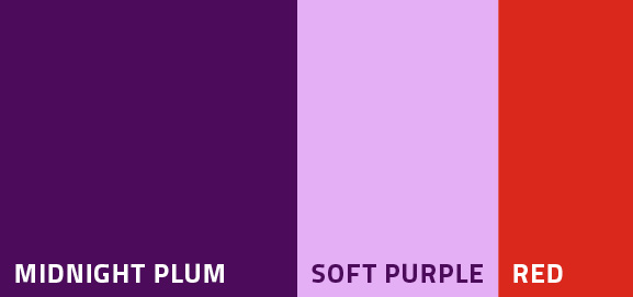
Red can be an alternative to create more contrast; however, it only passes the accessibility requirements for large text (18 pt. and above). Consider using bold text to increase readability.
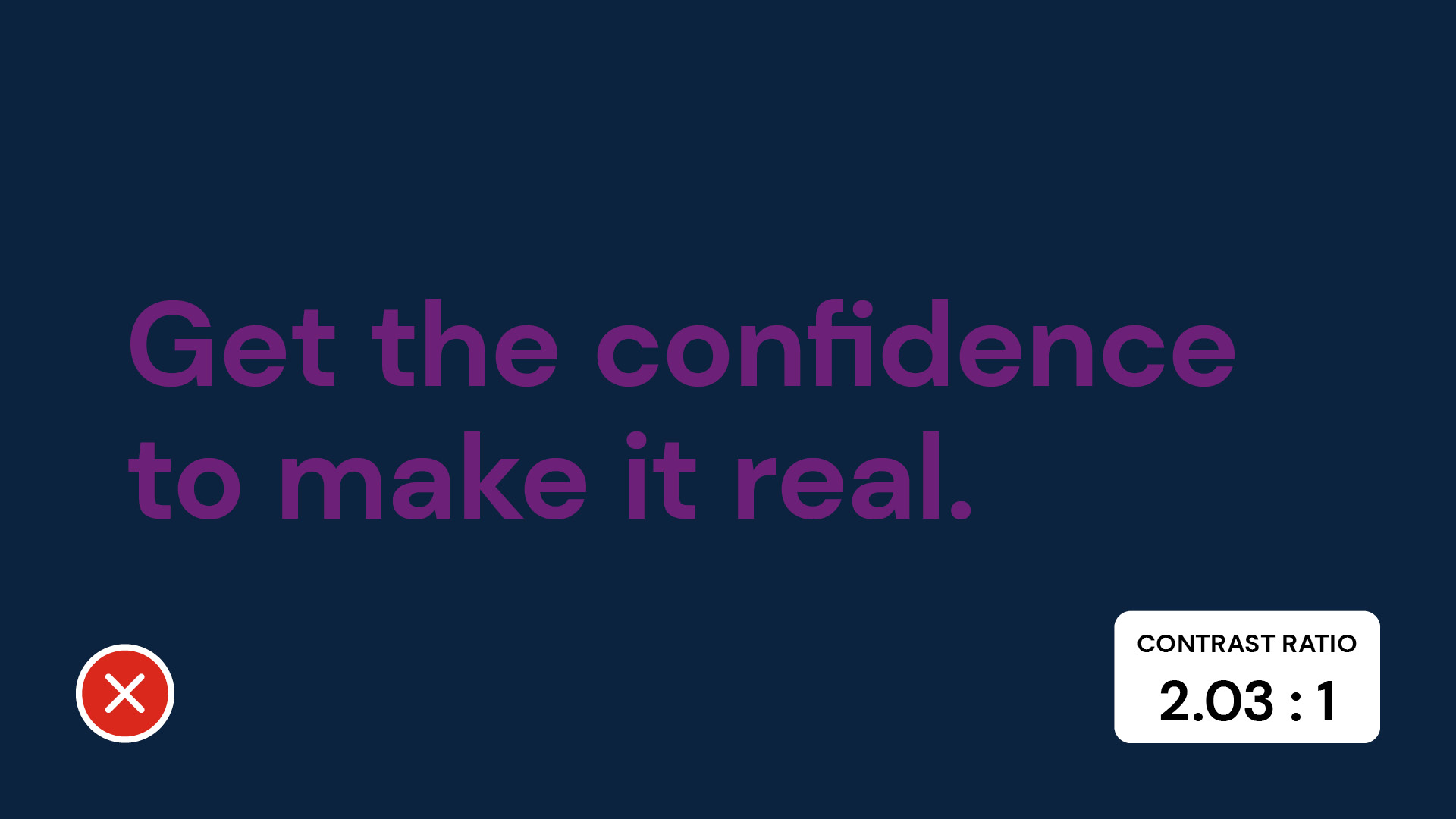
Purple over a dark blue background has a contrast ratio of 2.03 to 1. This colour combination does not have enough contrast to meet the minimum accessibility requirement of 4.5 to 1.
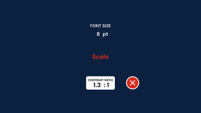
Scale
Scale can’t be ignored when it comes to accessibility. Ask yourself how the audience will read the piece you are creating. Is it a poster that needs to be readable at a distance? Or is it a social media ad that folks will read on their phone?
Smaller elements can be tricky to read from a distance, but increasing the contrast can make a big difference. To keep your design clear and easy to read, be sure to give smaller elements a higher contrast. You can achieve this by using bold text, highlight boxes or contrasting colours.
Larger elements are naturally easier to read, so some colour combinations may work — but only at a certain size (like 18 pt. and above). That said, it’s always best to double-check that everything on your page meets readability standards by running it through a contrast checker.
Questions?
Send us an email: brand.questions@sait.ca.

Oki, Âba wathtech, Danit'ada, Tawnshi, Hello.
SAIT is located on the traditional territories of the Niitsitapi (Blackfoot) and the people of Treaty 7 which includes the Siksika, the Piikani, the Kainai, the Tsuut’ina and the Îyârhe Nakoda of Bearspaw, Chiniki and Goodstoney.
We are situated in an area the Blackfoot tribes traditionally called Moh’kinsstis, where the Bow River meets the Elbow River. We now call it the city of Calgary, which is also home to the Métis Nation of Alberta.