A visual symbol of who we are
Our logo represents our brand. It’s instantly recognizable. It represents who we are, where we came from and where we’re going. Our logo and our visual identity are the foundations for how people see us. It helps to tell our story and shows our audiences that we’re ready for what’s next.
Our "Catalyst" symbol
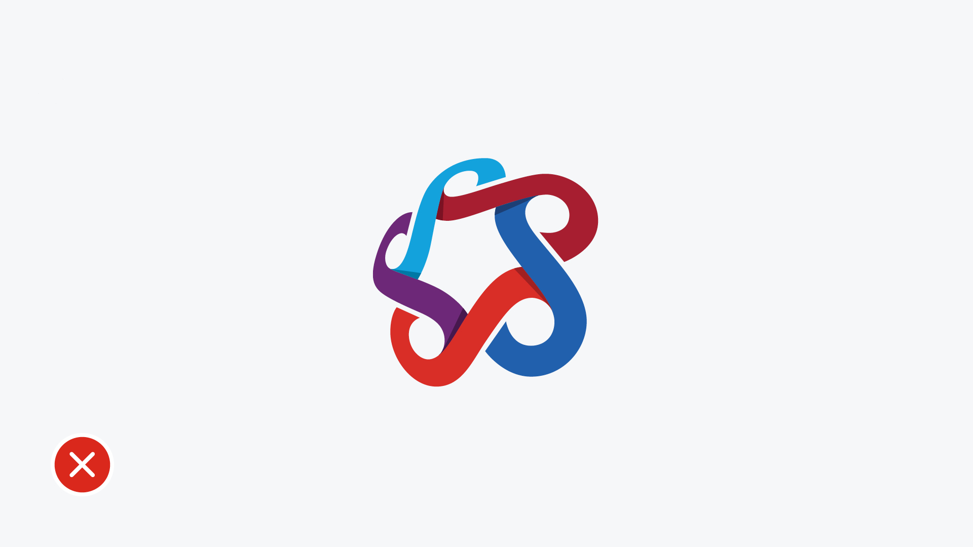
![]() The emblem in the SAIT logo is called the Catalyst - an activator of change. SAIT's symbol is forged by five S-shaped connectors representing the people and relationships that define us:
The emblem in the SAIT logo is called the Catalyst - an activator of change. SAIT's symbol is forged by five S-shaped connectors representing the people and relationships that define us:
- students
- faculty and staff
- alumni
- employers and partners
- the diverse communities we serve
As the connectors weave together, they create a series of interlocking infinity symbols that reflect the breadth of our offerings and the world of opportunities SAIT enables.
The star that emerges at the heart of our Catalyst expresses our passion for excellence as professionals and as a community.
SAIT's international outlook and global collaborations are echoed in the spherical shape of our symbol.
SAIT employees
Employees can download the .png files below. Please review the information below to see how to use our logo correctly in various contexts. If you are printing documents and require an .eps version or need a different file type, email us with your specific requirements:
Third-parties
Due to trademark specifications and the need to uphold the integrity of our logo's image, third parties must request the logo through the Marketing department.
The logo cannot be released until both parties mutually agree upon and sign the completed Trademark License Agreement form.
SAIT students
The use of the SAIT logo is limited for students. It cannot be used for student groups or events, promotional items, external presentations, resumes or portfolios, email signature or independent work. Students may use the logo for in-class projects, competitions and research posters.
Use the .png files available to download below. If you have an exceptional circumstance where you require a SAIT logo for external use, please contact brand.questions@sait.ca.
Logo structure
A catalyst ignites change. Forged by five S-shaped connectors, it represents the relationships that define us at SAIT. The connectors weave together, representing the breadth of our offerings and opportunities. The star that emerges at the heart of the catalyst reflects our passion for excellence.
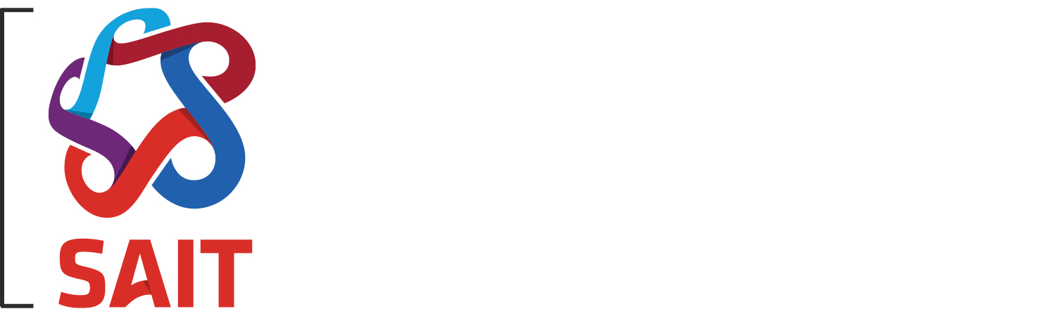
Our logo comprises two elements: our catalyst symbol and the SAIT wordmark. It is the primary identifier of our brand.
![]()
Primary logo
Our horizontal logo is our primary logo. There are full-colour, black one-colour and reverse versions of the horizontal logo.
The full-colour horizontal logo will be used in most applications — unless there are production challenges or unavoidable situations — and is best displayed on a white or light-coloured background.
Do not remove shadows from the reverse horizontal logo. It is used on approved coloured backgrounds.
![]()
Secondary logo
Our vertical logo is our secondary logo. There are full-colour, black one-colour and reverse versions of the vertical logo. Use the vertical version of the logo when it fits better within the space.
The full-colour vertical logo should be used in applications when it fits better within the space — unless there are production challenges or unavoidable situations — and is best displayed on a white or light-coloured background.
Do not remove shadows from the reverse vertical logo. It is used on approved coloured backgrounds.
![]()
Extended logo
Our full-colour extended logo is intended for promotional materials that may be used or viewed outside of Calgary and the surrounding area. Please use for national and international communications.
Note that in the current version, the colour text is charcoal.
Catalyst symbol
The catalyst should only be used on its own for app icons, social media icons and favicons. The full colour version is for SAIT’s main institutional channels only.
Colour variations
In certain applications where the colour version of the logo can’t be used, a reverse logo and a black one-colour logo have been created.
To maintain the integrity of the logo, do not remove the shadows within the reverse logo.
Do not change the black one-colour logo to a different colour.
Size and scale
The size and scale of our logo should be designed purposefully. Always be sure the elements of the logo can be easily seen and understood. If they are difficult to read, they may be too large or too small. Unless for a specific intent, do not crop the elements of the logo.
To maintain visual relationships, the logo should be scaled proportionally to the surrounding type. Use your best judgement – this will vary with application and type size.
Our logo has been thoughtfully crafted to read well at small sizes. That being said, be careful when scaling down. Use the following guidelines to ensure the integrity and readability of the logo.


Questions?
Send us an email: brand.questions@sait.ca.

Oki, Âba wathtech, Danit'ada, Tawnshi, Hello.
SAIT is located on the traditional territories of the Niitsitapi (Blackfoot) and the people of Treaty 7 which includes the Siksika, the Piikani, the Kainai, the Tsuut’ina and the Îyârhe Nakoda of Bearspaw, Chiniki and Goodstoney.
We are situated in an area the Blackfoot tribes traditionally called Moh’kinsstis, where the Bow River meets the Elbow River. We now call it the city of Calgary, which is also home to the Métis Nation of Alberta.